Industrial Dashboard Platform
This project involved a comprehensive UX/UI revamp of a React-based dashboard platform used for industrial and engineering data visualization. The goal was to modernize the interface, improve data readability, standardize components, and create a more intuitive experience for monitoring and analyzing complex metrics.
Project Overview
- UX/UI Redesign
- Frontend UI Integration
- Component Refactoring (Visuals)
- Data Visualization Styling
- Responsive Layout Adaptation
- Design System Implementation
- Figma
- React.js
- CSS/SCSS
- Chart Libraries
- UI Frameworks
- Responsive Design Techniques
- UI/UX Designer
- Frontend Developers
- Product Owner
The Problem
The original dashboard had grown organically over time, resulting in inconsistent styling, disjointed navigation, and a cluttered presentation of critical metrics. Users found it difficult to quickly identify key trends or anomalies.
The codebase lacked a unified design system, making UI updates slow and inconsistent. Furthermore, the dashboard was not optimized for different screen sizes, hindering usability on smaller monitors or tablets.
The Solution
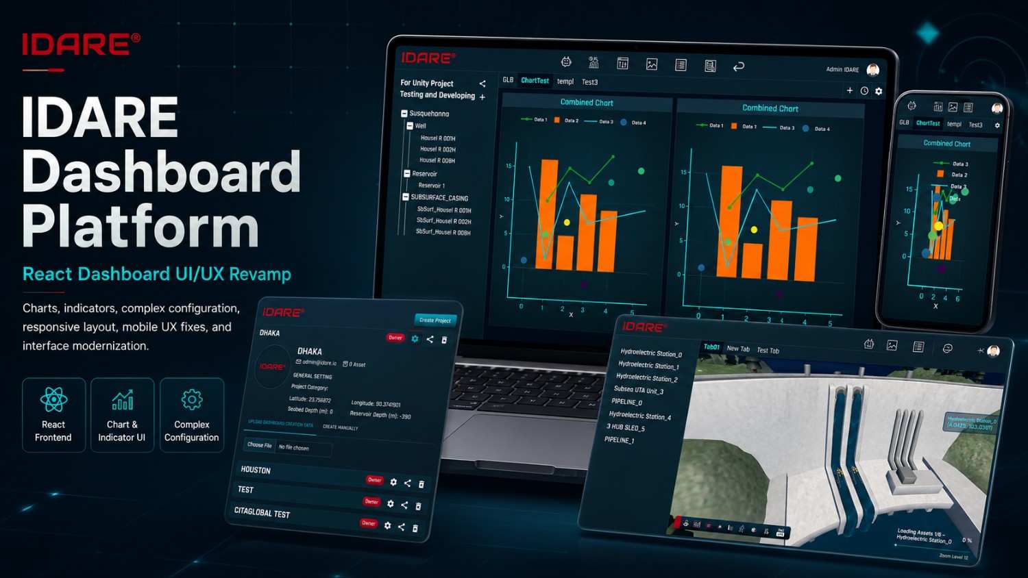
I initiated a complete visual overhaul, establishing a consistent design language with a refined color palette (focusing on clear status indicators), modernized typography, and standardized component styles (cards, buttons, inputs).
I restructured the layout to improve information architecture, prioritizing key metrics and utilizing better chart visualizations. I also worked closely with developers to implement these changes systematically, laying the groundwork for a more maintainable UI component library.
Final Design
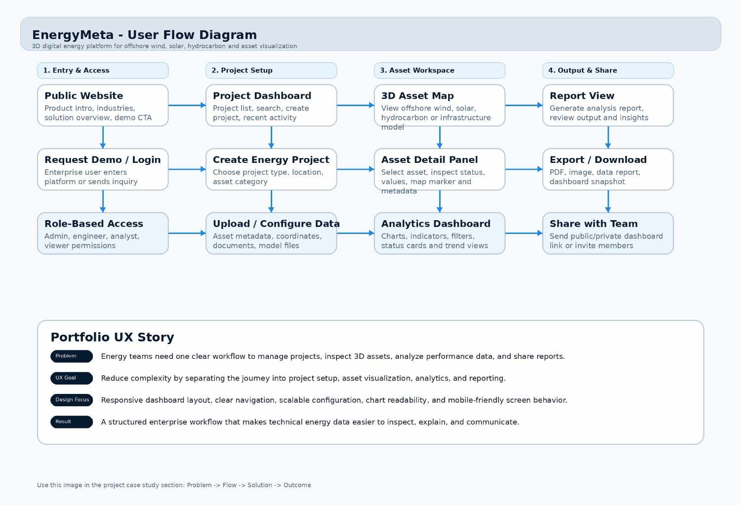
User Flow
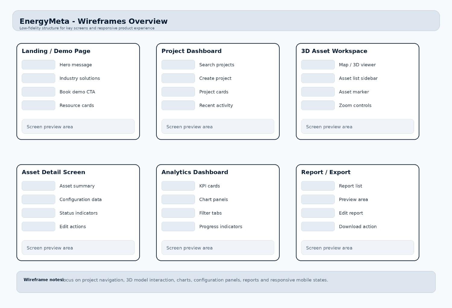
Wireframes
What I Learned
- A consistent design system is crucial for both user experience and development velocity in large dashboard applications.
- Data visualization is not just about choosing a chart; it's about context, labeling, and clear visual hierarchy.
- Refactoring an existing UI requires balancing visual improvements with technical constraints and development effort.
- Clear communication and collaboration with developers are essential to ensure the design vision is accurately implemented.
- Modernizing an interface goes beyond aesthetics; it must directly improve the user's ability to extract value from the data.
Let's build something great together
I'm open to new opportunities and exciting projects.